CSS 요약정리
|
문법
|
|
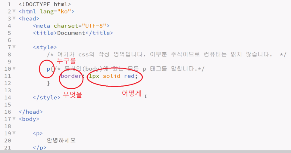
선택자 { 속성1: 값1; 속성2: 값2 }
/* or */
선택자 {
속성1: 값1;
속성2: 값2;
}
|
/* 모든 태그 */
*{
border: 1px solid red;
}
/* 태그 선택자 */
i{
}
/* 아이디 선택자 - 무조건 id는 전체 페이지에서 1개만! 중복 x */
#red{
border: 1px solid red;
}
/* 클래스 선택자 - 중복 가능 */
.blue{
border: 1px solid blue;
}
/* 동일한 속성에 대한 다중 선택자 */
p, i{
border: 1px solid red;
}
/* 자손 선택자 - 띄어쓰기 - 부모 선택자 같은 건 없다! 왜냐면 cascading 이니까 */
ul li{
border: 1px solid blue;
}
/* 자식(직계 자식) 선택자 */
ul> li {
border: 1px solid red;
}
/* 형제 선택자 - 아이디가 first인 태그와 같은 레벨에 밑으로 있는 모든 태그를 선택 */
#first ~ li{
border: 1px solid blue;
}
/* 인접 형제 선택자 - 아이디가 first인 태그와 같은 레벨에 바로 밑에 있는 태그 하나를 선택 */
#first + li{
border: 1px solid blue;
}
/* 가상 선택자 - 의사 클래스 */
a:visited {/* 한번 갔다 온 사이트 */
color: blue;
}
a:active {/* 마우스를 클릭하고 있는 중의 상태 */
color: yellow;
}
a{
text-decoration: none;
}
a:hover{/* 마우스를 올렸을 때 */
text-decoration: underline;
}
자주 쓰는 CSS
width, height 속성
개요
width와 height 속성은 각각 가로길이, 세로 길이를 의미합니다.
값을 정의할 때는 “100px”처럼 숫자 뒤에 단위를 표시하여 적습니다.
(px는 픽셀이라는 의미의며 ‘50%’처럼 ‘%’ 단위를 사용할 수도 있음)
<span> 태그 등 inline 요소는 적용되지 않는데, 이는 display 속성에서 다시 한번 다룹니다.
사용법
|
#box{ width: 100px; height: 60px }
|
예제
|
<html>
<body>
<div style="width: 150px; height: 80px; background-color: #d2f4ff; border: 2px solid #09c;">
150x80
</div>
<div style="width: 60px; height: 200px; background-color: #fde6ff; border: 2px solid #90C;">
90x120
</div>
</body>
</html>
|
margin, padding 속성
개요
margin과 padding 속성은 각각 바깥쪽 여백, 안쪽 여백을 의미합니다.
width, height 속성과 마찬가지로 숫자 뒤에 단위를 표시하여 적습니다.
margin과 padding는 border을 경계로 나뉩니다.
margin & padding
방향
방향마다 여백을 다르게 설정할 수 있습니다.
margin: 20px 같은 표현은 상하좌우 모두 20px을 의미합니다
margin: 30px 10px은 상하 30px, 좌우 10px을 의미합니다.
margin: 30px 10px 20px 50px은 위 30px, 오른쪽 10px, 아래 20px, 왼쪽 50px을 의미합니다.
margin: 30px 10px 40px은 위 30px, 좌우 10px, 아래 40px을 의미합니다.
즉 방향의 위부터 시계방향으로 회전하여 위 오른쪽 아래 왼쪽 순서로 설정합니다.
사용법
|
#box{ margin: 10px; padding: 20px }
|
예제
|
<html>
<head>
<style>
.box-container{
display: inline-block;
background-color: #d2f4ff;
border: 2px solid #09c;
margin: 5px 15px;
}
.box-container div{
width: 120px;
height: 80px;
background-color: #fde6ff;
border: 2px solid #90C;
font-size: 15px;
}
#box1{ margin: 10px; padding: 0; }
#box2{ margin: 5px 25px; padding: 0; }
#box3{ margin: 0; padding: 10px 30px 5px; }
#box4{ margin: 10px; padding: 10px 20px; }
#box5{ margin: 10px 30px 0 50px; padding: 30px 0 }
</style>
</head>
<body>
<div class="box-container">
<div id="box1">m: 10<br>p: 0</div>
</div>
<div class="box-container">
<div id="box2">m: 5 25<br>p: 0</div>
</div>
<div class="box-container">
<div id="box3">m: 0<br>p: 10 30 5</div>
</div>
<div class="box-container">
<div id="box4">m: 10<br>p: 10 20</div>
</div>
<div class="box-container">
<div id="box5">m: 10 30 0 50<br>p: 30 0</div>
</div>
</body>
</html>
|
|
#text1 { color: red; }
#text2 { color: #0A0; }
#text3 { color: rgb(0, 0, 150); }
#text4 { color: rgba(30, 150, 100, 0.5); }
|
예제
|
<html>
<body>
<div style="color: red">text1</div>
<div style="color: #0A0">text2</div>
<div style="color: rgb(0, 0, 150)">text3</div>
<div style="color: rgba(0, 140, 170, 0.5)">text4</div>
</body>
</html>
|
font 속성
개요
font 속성은 글자의 폰트를 정의하는 속성인데, 여러 기능을 동시에 가지고 있는 속성이기도 합니다.
정확히 말하면 6개의 세부적인 글꼴 관련 속성을 font라는 하나의 속성에 한 번에 쓸 수 있다는 소리입니다.
우선 세부적인 글꼴 관련 속성을 봅시다.
font-style 이탤릭체 등의 글꼴의 스타일 지정
font-weight 글자 두께
font-variant 글꼴 변형 (소문자를 대문자로 바꾸는 등의)
font-size 글자 크기
line-height 줄 단 격
font-family 글꼴 (굴림, 돋움, …)
font 속성은 다음과 같은 순서로 세부 속성을 한 번에 기술합니다.
font: font-style font-variant font-weight font-size/line-height font-family
font-style
글꼴의 스타일로, 주로 이탤릭체(기울여 표시)를 설정하기 위해 사용합니다.
normal: 기본
italic: 이탤릭체
font-weight
글꼴의 두께로, 미리 정의된 단어나 100 ~ 900 사이의 숫자를 통해 설정합니다.
기본값은 normal입니다.
100: lighter
200
300
400: normal
500
600
700: bold
800
900: bolder
font-size
글자 크기로, <font> 태그의 size 속성과 효과가 같습니다.
(HTML5부터 <font> 태그 사용은 권장되지 않으며, CSS를 사용해야 합니다)
px, px, em, 등의 단위와 small, big 등의 상수 크기를 사용할 수 있습니다.
(일반 웹 페이지에서는 px 사용)
font-family
글꼴 종류로, <font> 태그의 face 속성과 효과가 같습니다.
쉼표(,)로 여러 글꼴을 등록할 수 있는데, 이때 맨 앞에 있는 글꼴을 우선으로 적용시키며, 맨 앞에 있는 글꼴이 사용자의 컴퓨터에 없을 때 그다음 글꼴을 사용하게 됩니다.
사용법
|
.box1 {
font-size: 20px;
font-family: 나눔고딕,NanumGothic,돋움,Dotum;
}
.box1 .title { font-weight: bold }
.ex1 { font: 15px NanumGothic, sans-serif }
.ex2 { font: italic bold 12px/30px Dotum, sans-serif }
|
예제
|
<html>
<head>
<style>
#text1 { font-size: 37px }
#text2 { font-size: 28px }
#text3 { font-size: 19px }
.bold { font-weight: bold }
.italic{ font-style: italic }
.jinji{ font-family: "궁서" }
#text4{ font: italic bold 20px serif; }
</style>
</head>
<body>
<div id="text1">37px</div>
<div id="text2">28px</div>
<div id="text3">19px</div>
<br>
<div class="bold">굵은 글씨</div>
<div class="italic">기울인 글</div>
<div class="jinji">진지한 글꼴</div>
<br>
<div id="text4">There's no books on my backpack</div>
</body>
</html>
|
text-align 속성
개요
text-align 속성은 텍스트의 정렬 방향을 의미합니다.
left: 왼쪽 정렬
right: 오른쪽 정렬
center: 중앙 정렬
justify: 양쪽 정렬 (자동 줄 바꿈 시 오른쪽 경계선 부분 정리)
사용법
|
#box1 { text-align: right; }
#box2 { text-align: left; }
#box3 { text-align: center; }
|
예제
|
<html>
<head>
<style>
#box1 { text-align: right; }
#box2 { text-align: left; }
#box3 { text-align: center; }
</style>
</head>
<body>
<div id="box1">오른쪽 정렬</div>
<div id="box2">왼쪽 정렬</div>
<div id="box3">중앙 정렬</div>
</body>
</html>
|
background 속성
개요
background 속성은 태그의 배경을 지정하는 속성으로, font 속성과 비슷하게 세부적인 속성들을 한 번에 쓸 수 있는 속성입니다.
아래의 세부적인 속성을 가집니다.
background-color 배경 색
background-image 배경 이미지
background-repeat 배경 이미지 반복 여부
background-position 배경 이미지 위치
background-color
배경색을 의미하며, 값은 color 속성의 포맷을 사용합니다.
태그의 크기가 없을 경우 배경색은 표기되지 않습니다.
예제
|
<style>
#box1-1{ background-color: green; }
#box1-2{ background-color: #FF00CC; width: 200px }
</style>
<div id="box1-1">상자상자상자1</div>
<div id="box1-2">상자상자2<br>상자상자</div>
|
background-image
배경 이미지를 설정하며, 주로 이미지 경로를 지정하는 방식으로 사용합니다.
경로는 background-image: url("이미지 경로")처럼 작성합니다.
특별한 점은 컨테이너의 크기와 상관없이 삽입된 background-image의 크기는 컨테이너에 맞춰 늘어나거나 줄어들지 않고 그대로 표시되며,
이미지보다 컨테이너가 더 크다면 이미지는 반복되어 표시되게 됩니다.
예제
|
<style>
#box2-1 {
width: 100px;
height: 100px;
background-image: url("/images/attach/earth.jpg");
}
#box2-2{
width: 300px;
height: 150px;
margin-top: 30px;
background-image: url("/images/attach/earth.jpg");
}
</style>
<div id="box2-1"></div>
<div id="box2-2"></div>
|
background-repeat
background-image로 컨테이너보다 작은 이미지를 적용하면 이미지가 반복되어 출력됩니다.
이때 background-repeat 속성을 사용하면 반복 여부를 지정할 수 있습니다.
예제
|
<style>
.abox{
width: 500px;
height: 100px;
margin-bottom: 15px;
background-image: url("/images/attach/android.jpg");
border: 1px solid #AAA;
}
#box3-1{ background-repeat: no-repeat }
#box3-2{ background-repeat: repeat }
#box3-2{ background-repeat: repeat-x }
#box3-3{ background-repeat: repeat-y }
</style>
<div id="box3-1" class="abox"></div>
<div id="box3-2" class="abox"></div>
<div id="box3-3" class="abox"></div>
<div id="box3-4" class="abox"></div>
|
background-position
일반적으로 background-image는 왼쪽 위부터 이미지를 출력합니다.
background-position 속성을 사용하면 이미지의 좌표를 수정할 수 있게 됩니다.
margin, padding 속성에서 지정했던 것과 비슷하게 띄어쓰기를 기준으로 x좌표, y좌표를 지정합니다.
픽셀뿐만 아니라 left, top, center, bottom, right 등의 상수도 쓸 수 있습니다.
예제
|
<style>
.abox{
width: 500px;
height: 100px;
margin-bottom: 15px;
background-image: url("/images/attach/android.jpg");
border: 1px solid #AAA;
}
#box4-1{ background-position:center center; background-repeat: no-repeat }
#box4-2{ background-position:30px right; background-repeat: repeat }
#box4-3{ background-position:-100px -60px; background-repeat: repeat-x }
#box4-4{ background-position:40px -90px; background-repeat: repeat-y }
</style>
<div id="box4-1" class="abox"></div>
<div id="box4-2" class="abox"></div>
<div id="box4-3" class="abox"></div>
<div id="box4-4" class="abox"></div>
|
background
사용법
|
#box{ background: #09C url('image.png') no-repeat 10px center; }
|
예제
|
<html>
<head>
<style>
#box5{
width: 300px;
height: 100px;
background: yellow url('/images/attach/google.png') no-repeat center center;
}
</style>
</head>
<body>
<div id="box5"></div>
</body>
</html>
|
border 속성
개요
border 속성은 태그의 테두리를 설정하는 속성으로, background 속성과 비슷하게 세부적인 속성들을 한 번에 쓸 수 있는 속성입니다.
아래의 세부적인 속성을 가집니다.
border-width 테두리 두께
border-style 테두리 스타일
border-color 테두리 색
셋을 한번에 사용 시 width style color의 순서로 작성합니다.
border-width
테두리의 두께로, 주로 px 단위를 사용합니다.
border-color
테두리의 색상으로, 값은 color 속성의 포맷을 사용합니다.
border-style
테두리의 스타일로 실선, 점선, 이중선 등의 옵션이 존재합니다.
예제
|
<style>
.border-styles > p{
margin: 2px 0;
padding: 1px 3px;
border-width: 2px;
border-color: #aaa;
}
</style>
<div class="border-styles">
<p style="border-style: solid">solid</p>
<p style="border-style: dotted">dotted</p>
<p style="border-style: dashed">dashed</p>
<p style="border-style: double">double</p>
<p style="border-style: groove">groove</p>
<p style="border-style: ridge">ridge</p>
<p style="border-style: inset">inset</p>
<p style="border-style: outset">outset</p>
</div>
|
방향
테두리의 특정 방향만 따로 설정할 수도 있습니다.
border-top
border-bottom
border-left
border-right
border-bottom-color처럼 방향과 색, 두께, 스타일을 따로 설정할 수도 있습니다.
사용법
|
#box{ border: 4px dotted green; border-bottom: 5px solid blue }
|
예제
|
<html>
<head>
<style>
#box{
padding: 5px;
border: 4px dotted green;
border-bottom: 5px solid blue;
}
</style>
</head>
<body>
<div id="box">Simple Border Example</div>
</body>
</html>
|
visibility 속성
개요
visibility 속성은 태그의 가시성을 결정합니다.
아래의 4가지 값을 가지며, 기본 값은 inherit입니다.
visible: 보임
hidden: 숨김 (자신의 영역은 계속 차지)
collapse: 겹치도록 지정(테이블의 행과 열 요소만 지정할 수 있으며, 그 외 요소의 지정하면 hidden으로 해석)
inherit: 부모 요소의 값을 상속
사용법
|
#box1 { visibility: hidden; }
|
예제
|
<html>
<head>
<style>
.box{
width: 100px;
height: 100px;
background-color: #09C;
}
#box1{ visibility: hidden }
#box2{ visibility: visible }
</style>
</head>
<body>
<div id="box1" class="box"></div>
<div id="box2" class="box"></div>
</body>
</html>
|
display 속성
개요
display 속성은 요소를 어떻게 보여줄지를 결정합니다.
주로 4가지 속성 값이 쓰이는데, 태그마다 기본값이 다릅니다.
none : 보이지 않음
block : 블록 박스
inline : 인라인 박스
inline-block : block과 inline의 중간 형태
none
태그가 보이지 않게 되는데, visibility 속성을 hidden으로 설정한 것과 달리, 영역도 차지하지 않습니다.
block
<div>, <p> 태그 등이 이에 해당됩니다.
가로길이가 기본적으로 100%이며, block인 태그를 이어서 사용하면 줄 바꿈 되어 보입니다.
width, height 속성을 지정할 수 있으며, 레이아웃 배치 시 주로 쓰입니다.
inline
<span>, <b>, <i> 태그 등이 이에 해당됩니다.
block과 달리 줄 바꿈이 되지 않고, width와 height를 지정할 수 없습니다.
inline-block
block과 inline의 중간 형태라고 볼 수 있는데, 줄 바꿈이 되지 않지만 크기를 지정 할 수 있습니다.
Internet Explorer 7 이하에서는 사용할 수 없으며 *zoom: 1이라는 속성을 사용하면 비슷하게 사용할 수 있습니다. (이는 CSS IE 핵 중 하나입니다)
사용법
|
#none{ display:none;}
#block{ display:block; }
#inline{ display:inline; }
#inline-block{ display:inline-block; *zoom:1; *display:inline }
|
예제
|
<html>
<head>
<style>
#box-container > div,
#box-container > span{
border: 2px solid #09c;
margin: 3px 0;
padding: 5px;
}
.none{ display: none }
.block1{ display: block }
.block2{ display: block; width: 300px; height: 60px; }
.inline{ display: inline; width: 200px; height: 60px; }
.inline-block{ display: inline-block; width: 200px; height: 60px; *zoom: 1; }
</style>
</head>
<body>
<div id="box-container">
<div class="none">none</div>
<div class="block1">block1</div>
<div class="block2">block2</div>
<span class="inline">inline</span>
<span class="inline-block">inline-block</span>
</div>
</body>
</html>
|
float 속성
개요
float라는 단어는 원래 ‘뜨다’라는 의미이며, 원래 웹페이지에서 이미지를 어떻게 띄워서 텍스트와 함께 배치할 것인가에 대한 속성입니다.
inherit: 부모 요소에서 상속
left: 왼쪽에 부유하는 블록 박스를 생성. 페이지 내용은 박스 오른쪽에 위치하며 위에서 아래로 흐름.
right: 오른쪽에 부유하는 블록 박스를 생성. 페이지 내용은 박스 왼쪽에 위치하며 위에서 아래로 흐름. 이후 요소에 clear 속성이 있으면 페이지 흐름이 달라짐. none 이 아니라면 display 속성은 무시된다.
none - 요소를 부유시키지 않음
left와 right를 통해 부유 속성을 지정 시 display는 무시됩니다. (none은 제외)
또한 이후 요소에 clear 속성이 있으면 페이지 흐름이 달라집니다.
사용법
|
.content > img{ float: left }
|
예제
|
<html>
<head>
<style>
.float-container{
width: 320px;
border: 2px solid #09c;
}
.float-container img{
float: left;
margin: 5px;
padding: 5px;
border: 2px solid #90C;
}
</style>
</head>
<body>
<div class="float-container">
<img src="/images/attach/earth.jpg">
Lorem ipsum dolor sit amet, consectetur adipisicing elit, sed do eiusmod
tempor incididunt ut labore et dolore magna aliqua. Ut enim ad minim veniam,
quis nostrud exercitation ullamco laboris nisi ut aliquip ex ea commodo
consequat. Duis aute irure dolor in reprehenderit in voluptate velit esse
cillum dolore eu fugiat nulla pariatur. Excepteur sint occaecat cupidatat non
proident, sunt in culpa qui officia deserunt mollit anim id est laborum.
</div>
</body>
</html>
|
레이아웃에서의 float
float 속성은 원래 이미지와 텍스트 배치 용도로 등장했지만, 요즘에는 레이아웃용으로 많이 사용하고 있습니다.
<div> 태그를 float 속성 및 width, height 속성 등을 이용하여 레이아웃을 배치하는 방식입니다.
예제
|
<html>
<head>
<style>
.ex-layout{ height: 310px }
.menu{
width: 300px;
height: 40px;
border: 2px solid #09c;
background-color: #d7f5ff;
}
.main .left-menu{
float: left;
width: 50px;
height: 254px;
border: 2px solid red;
background-color: #ffe7d5;
}
.main .content{
float: left;
width: 250px;
height: 250px;
}
.main .content .article{
height: 200px;
border: 2px solid blue;
background-color: #e2e9ff;
}
.main .content .comment{
height: 50px;
border: 2px solid purple;
background-color: #ffddff;
}
</style>
</head>
<body>
<div class="ex-layout">
<div class="menu">global menu</div>
<div class="main">
<div class="left-menu">left menu</div>
<div class="content">
<div class="article">article</div>
<div class="comment">comment</div>
</div>
</div>
</div>
</body>
</html>
|
clear 속성
개요
float 속성을 통해 태그를 부유시킨 이후 문서의 흐름을 제거하기 위해 쓰입니다.
방향에 따라 3가지 속성을 사용할 수 있습니다.
left: 좌측 부유 제거
right: 우측 부유 제거
both: 양쪽 모두 제거
예제
|
<html>
<head>
<style>
.float-container{ width: 320px; border: 2px solid #09c; }
.float-container img{ float: left; margin: 5px; padding: 5px; border: 2px solid #90C; }
</style>
</head>
<body>
<div class="float-container">
<img src="/images/attach/earth.jpg">
<p>This is first line with floating image.</p>
<p style="clear: both">This is second line with cleared property.</p>
</div>
</body>
</html>
|
레이아웃에서의 clear
float 속성이 레이아웃에서 많이 사용한다고 하였는데, clear속성도 float를 레이아웃에서 사용하며 발생되는 문제를 해결하기 위해 많이 사용됩니다.
float 속성을 적용한 태그는 붕 뜨며 정상적인 요소로 처리가 안되기 때문에
아래에 나타나야 하는 내용이 부유된 태그의 중간에 나타나는 문제 및 상위 태그의 높이가 없어지는 문제 등이 발생하게 됩니다.
예제
|
<style>
.box-container{
width: 350px;
border: 2px solid #09c;
background-color: #d7f5ff;
}
.box-container .box{
width: 80px;
height: 40px;
border: 2px solid red;
background-color: #ffe7d5;
}
</style>
<div class="box-container">
<div class="box" style="float: left">박스1</div>
<div class="box" style="float: right">박스2</div>
</div>
<div>박스 아래에 나타나야 하는 내용</div>
|
예제
|
<div class="box-container">
<div class="box" style="float: left">박스1</div>
<div class="box" style="float: right">박스2</div>
<div style="clear: both"></div>
</div>
<div>박스 아래에 나타나야 하는 내용</div>
|
after 가상 선택자와 clear
clear 해주기 위해서는 float 된 요소 다음에 clear 하는 태그를 따로 삽입해야 하는 불편함이 있습니다.
이때 가상 클래스 선택자를 이용하면 이 문제를 해결할 수 있습니다.
부유를 제거하고 싶은 컨테이너에 다음 클래스를 적용시키면 문제가 해결됩니다.
사용법
|
.clearfix:after{ content: ""; display: block; clear: both }
|
하지만 after가상 선택자는 IE(Internet Explorer) 8 이하 버전에서 동작하지 않는데, 컨테이너 태그에 *zoom: 1이라는 옵션을 사용하면 비슷하게 문제가 해결됩니다.
예제
|
<style type="text/css">
.clearfix{ *zoom: 1; }
.clearfix:after{ content: ""; display: block; clear: both }
</style>
<div class="box-container clearfix">
<div class="box" style="float: left">박스1</div>
<div class="box" style="float: right">박스2</div>
</div>
<div>박스 아래에 나타나야 하는 내용</div>
|
position 속성
개요
position 속성은 태그를 어떻게 위치시킬지를 정의하며, 아래의 5가지 값을 갖습니다.
static: 기본값, 다른 태그와의 관계에 의해 자동으로 배치되며 위치를 임의로 설정해 줄 수 없습니다.
absolute: 절대 좌표와 함께 위치를 지정해 줄 수 있습니다.
relative: 원래 있던 위치를 기준으로 좌표를 지정합니다.
fixed: 스크롤과 상관없이 항상 문서 최 좌측 상단을 기준으로 좌표를 고정합니다.
inherit: 부모 태그의 속성 값을 상속받습니다.
좌표를 지정해주기 위해서는 left, right, top, bottom 속성과 함께 사용합니다.
position을 absolute나 fixed로 설정 시 가로 크기가 100%가 되는 block 태그의 특징이 사라지게 됩니다.
사용법
|
#box1 { position:static }
#box2 { position:absolute }
#box3 { position:relative }
#box4 { position:fixed }
#box5 { position:inherit }
|
예제
|
<html>
<head>
<style>
.box-container{
width: 350px;
border: 2px solid #e91bf5;
}
.box-container div{
padding: 10px;
border: 1px solid green;
background-color: #e3ffe0;
}
#box1 { position: static; top: 20px; left: 30px; }
#box2 { position: relative; top: 20px; left: 30px; }
#box3 { position: absolute; top: 20px; right: 30px; }
#box4 { position: fixed; top: 20px; right: 30px; }
</style>
</head>
<body>
<div class="box-container">
<div id="box1">static 박스</div>
<div id="box2">relative 박스</div>
<div id="box3">absolute 박스</div>
<div id="box4">fixed 박스</div> <!-- '출력 결과' 란이 아닌, 전체 페이지에서 고정되어 보여짐 -->
</div>
</body>
</html>
|
absolute와 relative
relative 인 컨테이너 내부에 absolute인 객체가 있으면 절대 좌표를 계산할 때, relative 컨테이너를 기준점으로 잡게 됩니다. (없다면 전체 문서가 기준)
예제
|
<html>
<head>
<style>
#box-container{ position: relative; height: 90px; margin-top: 40px; border: 2px solid red; }
#box-inner{ position: absolute; top: 30px; left: 20px; border: 2px solid blue; }
</style>
</head>
<body>
<div id="box-container">
컨테이너
<div id="box-inner">absolute 박스</div>
</div>
</body>
</html>
|
cursor 속성
개요
cursor 속성을 이용하면 해당 태그 위에 위치하는 마우스 커서의 모양을 바꿀 수 있습니다.
auto: 자동
default: 기본값 (화살표)
pointer: 손가락 모양 (클릭 가능한 버튼)
wait: 로딩
등 다양한 종류의 값이 있습니다.
사용법
|
.btn-wait { cursor: wait }
|
예제
|
<style type="text/css">
.cursors span{
display: inline-block;
margin: 5px;
padding: 5px 10px;
background-color: #d2f4ff;
border: 2px solid #09c;
}
</style>
<div class="cursors">
<span style="cursor: auto">Auto</span>
<span style="cursor: crosshair">Crosshair</span>
<span style="cursor: default">Default</span>
<span style="cursor: pointer">Pointer</span>
<span style="cursor: move">Move</span>
<span style="cursor: e-resize">e-resize</span>
<span style="cursor: ne-resize">ne-resize</span>
<span style="cursor: nw-resize">nw-resize</span>
<span style="cursor: n-resize">n-resize</span>
<span style="cursor: se-resize">se-resize</span>
<span style="cursor: sw-resize">sw-resize</span>
<span style="cursor: s-resize">s-resize</span>
<span style="cursor: w-resize">w-resize</span>
<span style="cursor: text">Text</span>
<span style="cursor: wait">Wait</span>
<span style="cursor: help">Help</span>
</div>
|
'IT와 코딩' 카테고리의 다른 글
| AWS 유분투에 그누보드 올려보기 (0) | 2022.09.18 |
|---|---|
| 피온4 감독모드 파이썬으로 초보자도 매크로를 만들어 보자 pyautogui 와 pydirectinput (4) | 2022.09.11 |
| python 3.9 버전 cuda 설치하여 pytorch 연동하기 (0) | 2022.09.09 |
| 이번에 IPTIME 무선 공유기 교체를 해 보았다 AX2004M white (0) | 2022.09.08 |
| CSS 요약 정리 2 (2) | 2022.09.08 |


댓글