CSS 트랜지션
트랜지션(transition)은 CSS 프로퍼티의 값이 변화할 때, 프로퍼티 값의 변화가 일정 시간(duration)에 걸쳐 일어나도록 하는 것이다. 예를 들어 아래의 예제를 살펴보자. div 요소는 기본 상태에서 hover 상태로 변화할 때, CSS 프로퍼티 border-radius와 background 프로퍼티의 값이 변화한다.
|
예제
|
|
<!DOCTYPE html>
<html>
<head>
<style>
div { /* 네모상자 */
width: 100px;
height: 100px;
background: red;
}
div:hover { /* 네모상자에 마우스를 올렸을 때 */
border-radius: 50%;
background: blue;
}
</style>
</head>
<body>
<div></div>
</body>
</html>
|
=> div {
...
transition: all 2s; /* 추가해 보기 */
}
또는
div:hover {
...
transition: all 2s; /* 추가 해 보기 */
}

1. transition-property
transition-property 프로퍼티는 트랜지션의 대상이 되는 CSS 프로퍼티명을 지정한다. 지정하지 않은 경우 모든 프로퍼티가 트랜지션의 대상이 된다. 복수의 프로퍼티를 지정하는 경우 쉼표(,)로 구분한다.
|
예제
|
|
<!DOCTYPE html>
<html>
<head>
<style>
div {
width: 100px;
height: 50px;
background-color: red;
margin-bottom: 10px;
transition-property: width, background-color;
transition-duration: 2s, 2s; /* 크기 2초, 배경색 2초*/
}
div:hover {
width: 300px;
background-color: blue;
}
</style>
</head>
<body>
<div></div>
</body>
</html>
|
요소의 프로퍼티 값이 변화하면 브라우저는 프로퍼티 값의 변화에 영향을 받는 모든 요소의 기하값(위치와 크기)을 계산하여 layout 작업을 수행한다. 이것은 브라우저에게 스트레스를 주어 성능 저하의 요인이 된다. 심지어 다수의 자식 요소를 가지고 있는 요소(예를 들어 body 요소)가 변경되면 모든 자식 요소의 기하 값이 재계산될 수도 있다. 따라서 layout에 영향을 주는 트랜지션 효과는 회피하도록 노력해야 한다.
transition-property의 대상이 가능한 속성들
// Box model 관련
width height max-width max-height min-width min-height
padding margin
border-color border-width border-spacing
// Background
background-color background-position
// 좌표
top left right bottom
// 텍스트
color font-size font-weight letter-spacing line-height
text-indent text-shadow vertical-align word-spacing
// 기타
opacity outline-color outline-offset outline-width
visibility z-index
|
* layout에 영향을 주는 프로퍼티
|
|
width height padding margin border
display position float overflow
top left right bottom
font-size font-family font-weight
text-align vertical-align line-height
clear white-space
|
2. transition-duration
transition-duration 프로퍼티는 트랜지션에 일어나는 지속시간(duration)을 초 단위(s) 또는 밀리 초 단위(ms)로 지정한다. 프로퍼티값을 지정하지 않을 경우 기본값 0s이 적용되어 어떠한 트랜지션 효과도 볼 수 없다.
|
사용 예
|
|
|
|
|
|
div {
transition-property: width;
transition-duration: 2s;
}
|
|
div {
transition-property: width, opacity;
transition-duration: 2s, 4s;
}
|
|
div {
/* shorthand syntax */
transition: width 2s, opacity 4s;
}
|
|
div {
transition-property: width, opacity, left, top;
transition-duration: 2s, 1s;
}
|
3. transition-timing-function
트랜지션 효과의 변화 흐름, 시간에 따른 변화 속도와 같은 일종의 변화의 리듬을 지정한다.
대부분의 타이밍 함수는 큐빅 베이지어(cubic bezier)를 정의하는 네 점에 의해 정의되므로 상응하는 함수의 그래프로 제공해서 명시할 수 있다. transition-timing-function 프로퍼티 값으로 미리 정해둔 5개의 키워드가 제공된다. 기본값은 ease이다.
|
예제
|
|
<!DOCTYPE html>
<html>
<head>
<style>
div {
font: bold 16px/50px "Open Sans";
color: white;
text-align: center;
width: 100px;
height: 50px;
background-color: red;
margin-bottom: 10px;
transition: width 2s;
}
div:nth-child(1) {
transition-timing-function: ease;
}
|

|
div:nth-child(2) {
transition-timing-function: linear;
}
div:nth-child(3) {
transition-timing-function: ease-in;
}
div:nth-child(4) {
transition-timing-function: ease-out;
}
div:nth-child(5) {
transition-timing-function: ease-in-out;
}
div:hover {
width: 300px;
}
</style>
</head>
<body>
<h3>transition-timing-function</h3>
<div>ease</div>
<div>linear</div>
<div>ease-in</div>
<div>ease-out</div>
<div>ease-in-out</div>
</body>
</html>
|
4. transition-delay
프로퍼티가 변화한 시점과 트랜지션이 실제로 시작하는 사이에 대기하는 시간을 초 단위(s) 또는 밀리 초 단위(ms)로 지정한다. 즉, transition-delay로 대기 사간을 지정하여 프로퍼티의 값이 변화하여도 즉시 트랜지션이 실행되지 않고, 일정 시간 대기한 후 트랜지션이 실행되도록 한다.
|
예제
|
|
<!DOCTYPE html>
<html>
<head>
<style>
div {
font: bold 16px/50px "Open Sans";
color: white;
text-align: center;
width: 100px;
height: 50px;
background-color: red;
|
|
margin-bottom: 10px;
transition: width 1s;
}
div:nth-of-type(1) {
transition-delay: 0s;
}
div:nth-of-type(2) {
transition-delay: 1s;
}
div:nth-of-type(3) {
transition-delay: 3s;
}
div:hover {
width: 300px;
}
</style>
</head>
<body>
<h3>transition-delay</h3>
<div>0s</div>
<div>1s</div>
<div>3s</div>
</body>
</html>
|
5. transition
모든 트랜지션 프로퍼티를 한 번에 지정할 수 있는 shorthand이다. 값을 지정하지 않은 프로퍼티에는 기본값이 지정된다. 지정 방법은 다음과 같다.
transition: property duration function delay
transition-duration은 반드시 지정해야 한다. 지정하지 않은 경우 기본값 0이 세팅되어 어떠한 트랜지션도 실행되지 않는다. 기본값은 아래와 같다.
all 0 ease 0
|
예제
|
|
<!DOCTYPE html>
<html>
<head>
<style>
div {
font: bold 0.5em/50px "Open Sans";
color: white;
|
|
text-align: center;
width: 100px;
height: 50px;
margin-bottom: 10px;
background-color: red;
}
div:nth-of-type(1) {
/* property duration function delay */
transition: width 1s ease-in 1s;
}
div:nth-of-type(2) {
/* duration */
transition: 1s
}
div:nth-of-type(3) {
/* property duration */
transition: width 1s
}
div:nth-of-type(4) {
/* duration function */
transition: 1s ease-in;
}
div:nth-of-type(5) {
/* duration delay*/
transition: 1s 1s;
}
div:hover {
width: 300px;
}
</style>
</head>
<body>
<div>width 1s ease-in 1s</div>
<div>1s</div>
<div>width 1s</div>
<div>1s ease-in</div>
<div>1s 1s</div>
</body>
</html>
|
CSS Animation
애니메이션(Animation) 효과는 HTML 요소에 적용되는 CSS 스타일을 다른 CSS 스타일로 부드럽게 변화시킨다. 애니메이션은 애니메이션을 나타내는 CSS 스타일과 애니메이션의 sequence(영화·텔레비전에서, 몇 개의 장면이 모여 하나의 삽화를 이룬 것. 연속된 하나의 장면 설정)를 나타내는 복수의 키프레임(@keyframes) 들로 이루어진다.
transition으로도 어느 정도의 애니메이션 효과를 표현할 수 있으나 animation보다는 제한적이다. 일반적으로 트랜지션 효과는 요소 속성 값이 다른 값으로 변화할 때 주로 사용하며 각 요소가 로딩되었을 때 발동되지 않는다. :hover 와 같은 가상 클래스 선택자(Pseudo-Class Selector) 또는 자바스크립트의 이벤트와 같은 부수적 액션에 의해 발동된다.
즉 transition 프로퍼티는 단순히 요소의 속성 변화에 주안점이 있다면 animation 프로퍼티는 하나의 줄거리를 구성하여 줄거리 내에서 세부 움직임을 시간 흐름 단위로 제어할 수 있고 전체 줄거리의 재생과 정지, 반복까지 제어할 수 있다.
일반적으로 CSS 애니메이션을 사용하면 기존의 JavaScript 기반 애니메이션 실행과 비교하여 더 나은 렌더링 성능을 제공한다고 알려져 있다. 그러나 경우에 따라서는 JavaScript를 사용하는 것이 나을 수도 있다. jQuery 등의 애니메이션 기능은 CSS보다 간편하게 애니메이션 효과를 가능케 한다.
비교적 작은 효과나 CSS만으로도 충분한 효과를 볼 수 있는 것은 CSS를 사용한다. 예를 들어 요소의 width 변경 애니메이션은 자바스크립트를 사용하는 것보다 훨씬 간편하며 효과적이다.
세밀한 제어를 위해서는 자바스크립트 사용이 바람직하다. 예를 들어 바운스, 중지, 일시 중지, 되감기 또는 감속과 같은 고급 효과는 자바스크립트가 훨씬 유용하다.
가장 중요한 것은 브라우저에서 애니메이션 효과가 부드럽게 실행되는 것이다. 그리고 애니메이션 효과 작성에 소요되는 시간과 수고이다. 여러 사항들을 고려하여 자바스크립트를 사용하여야 할지 CSS를 사용하여야 할지 결정하여야 한다.

1. @keyframes
@keyframes
CSS 애니메이션과 트랜지션 방식의 주된 차이는 @keyframes rule에 있다. 이 rule을 사용하면 애니메이션의 흐름(sequence) 중의 여러 시점(breakpoint)에서 CSS 프로퍼티 값을 지정할 수 있다.
|
예제
|
|
<!DOCTYPE html>
<html>
<head>
<style>
div {
position: absolute;
width: 100px;
height: 100px;
background-color: red;
animation-name: move;
animation-duration: 5s;
animation-iteration-count: infinite;
}
/* @keyframes rule */
@keyframes move {
/* keyframe */
from {
left: 0;
}
/* keyframe */
to {
left: 300px;
}
}
</style>
</head>
<body>
<div></div>
</body>
</html>
|
@keyframes rule은 시간의 흐름에 따라 애니메이션을 정의한다. 여러 개의 키프레임을 정의하거나 애니메이션 중에 특정 CSS 프로퍼티에 값을 지정하는 지점을 정의할 수 있다.
위 예제를 보면 @keyframes 뒤에 애니메이션을 대표하는 임의의 이름을 부여하였다.
@keyframes move {}
from, to 키워드를 사용하여 애니메이션의 시작과 끝 시점을 정의하였다. 그리고 애니메이션의 시작 시점을 의미하는 from 키프레임 내에는 left 프로퍼티에 값 0을, 애니메이션의 끝 시점을 의미하는 to 키프레임 내에는 left 프로퍼티에 값 300px을 지정하였다. 그 결과, 정지 상태에서 오른쪽으로 300px 이동하는 애니메이션이 실행된다.
사용 예
|
@keyframes move {
/* 애니메이션 시작 시점 */
from { left: 0; }
/* 애니메이션 종료 시점 */
to { left: 300px; }
}
|
from, to 키워드 대신 %를 사용할 수 있다. 또한 시작과 끝 키프레임 사이에 % 단위로 키프레임을 삽입할 수 있다.
|
@keyframes move {
0% { left: 0; }
50% { left: 100px; }
100% { left: 300px; }
}
|
2. animation-name
위 예제를 보면 @keyframes 뒤에 애니메이션을 대표하는 임의의 이름을 부여하였다.
@keyframes move {}
|
예제
|
|
<!DOCTYPE html>
<html>
<head>
<style>
div {
position: absolute;
width: 100px;
height: 100px;
animation-name: move, fadeOut, changeColor;
animation-duration: 5s;
animation-iteration-count: infinite;
}
@keyframes move {
from { left: 0; }
to { left: 300px; }
}
@keyframes fadeOut {
from { opacity: 1; }
to { opacity: 0; }
}
|
|
@keyframes changeColor {
from { background-color: red; }
to { background-color: blue; }
}
</style>
</head>
<body>
<div></div>
</body>
</html>
|
3. animation-duration
한 사이클의 애니메이션에 소요되는 시간을 초 단위(s) 또는 밀리 초 단위(ms)로 지정한다.
animation-duration: .5s;
animation-duration: 500ms;
animation-duration은 반드시 지정해야 한다. 지정하지 않은 경우 기본값 0s가 세팅되어 어떠한 애니메이션도 실행되지 않는다.
4. animation-delay
요소가 로드된 시점과 애니메이션이 실제로 시작하는 사이에 대기하는 시간을 초 단위(s) 또는 밀리 초 단위(ms)로 지정한다.
animation-delay: 2s;
5. animation-iteration-count
애니메이션 주기의 재생 횟수를 지정한다. 기본값은 1이며 infinite로 무한반복할 수 있다.
animation-iteration-count: 3;
6. animation-direction
애니메이션이 종료된 이후 반복될 때 진행하는 방향을 지정한다.

|
예제
|
|
<!DOCTYPE html>
<html>
<head>
<style>
div {
width: 100px;
height: 100px;
background: red;
position: relative;
animation: myAnimation 5s infinite;
/*홀수번째는 normal로, 짝수번째는 reverse로 진행*/
animation-direction: alternate;
}
@keyframes myAnimation {
0% { background: red; left: 0px; top: 0px; }
25% { background: yellow; left: 200px; top: 0px; }
50% { background: blue; left: 200px; top: 200px; }
75% { background: green; left: 0px; top: 200px; }
100% { background: red; left: 0px; top: 0px; }
}
</style>
</head>
<body>
<div></div>
</body>
</html>
|
7. animation-fill-mode
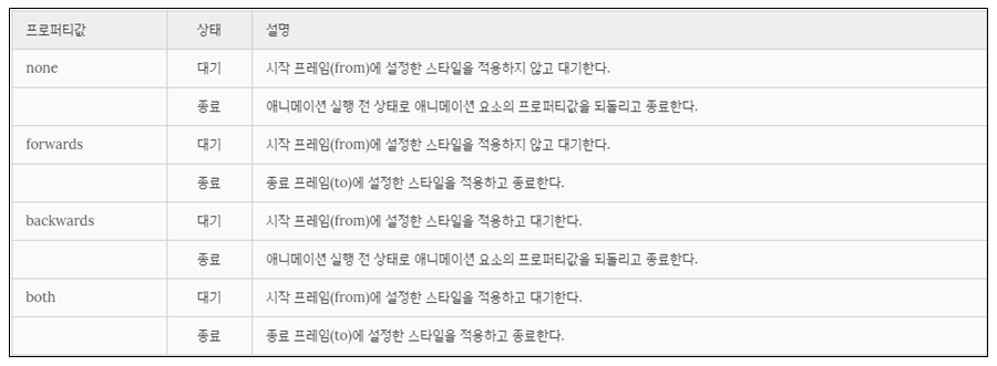
애니메이션 미실행 시(대기 또는 종료) 요소의 스타일을 지정한다.
|
예제
|
|
<!DOCTYPE html>
<html>
<head>
<style>
div {
width: 100px;
height: 100px;
font: bold 1em/100px san-serif;
text-align: center;
color: #fff;
background: red;
margin-bottom: 10px;
position: relative;
/*name duration timing-function delay iteration-count direction fill-mode play-state*/
animation: myAnimation 2s linear 2s;
}
div:nth-of-type(1) {
animation-fill-mode: none;
}
div:nth-of-type(2) {
animation-fill-mode: forwards;
}
div:nth-of-type(3) {
animation-fill-mode: backwards;
}
div:nth-of-type(4) {
animation-fill-mode: both;
}
@keyframes myAnimation {
0% { left: 0px; background: yellow; }
100% { left: 200px; background: blue; }
}
</style>
</head>
<body>
<h1>animation-fill-mode</h1>
<div>none</div>
<p>대기 : 시작 프레임(from)에 설정한 스타일을 적용하지 않고 대기한다.</p>
<p>종료 : 애니메이션 실행 전 상태로 애니메이션 요소의 프로퍼티값을 되돌리고 종료한다.</p>
<div>forwards</div>
<p>대기 : 시작 프레임(from)에 설정한 스타일을 적용하지 않고 대기한다.
<p>종료 : 종료 프레임(to)에 설정한 스타일을 적용하고 종료한다.
|
|
<div>backwards</div>
<p>대기 : 시작 프레임(from)에 설정한 스타일을 적용하고 대기한다.
<p>종료 : 애니메이션 실행 전 상태로 애니메이션 요소의 프로퍼티값을 되돌리고 종료한다.
<div>both</div>
<p>대기 : 시작 프레임(from)에 설정한 스타일을 적용하고 대기한다.
<p>종료 : 종료 프레임(to)에 설정한 스타일을 적용하고 종료한다.
</body>
</html>
|
8. animation-play-state
애니메이션 재생 상태(재생 또는 중지)를 지정한다. 기본값은 running이다.
|
예제
|
|
<!DOCTYPE html>
<html>
<head>
<style>
div {
width: 100px;
height: 100px;
background: red;
position: relative;
/*name duration timing-function delay iteration-count direction fill-mode play-state*/
animation: move 5s infinite;
}
div:hover {
background: blue;
animation-play-state: paused;
}
div:active {
background: yellow;
animation-play-state: running;
}
@keyframes move {
from { left: 0px; }
to { left: 200px; }
}
</style>
</head>
<body>
<h1>animation-play-state</h1>
<div></div>
</body>
</html>
|
|
예제2
|
|
<!DOCTYPE html>
<html>
<head>
<style>
.box {
position: relative;
width: 100px;
height: 100px;
background-color: red;
animation-name: move;
animation-duration: 5s;
animation-play-state: paused; /* 초기 애니메이션 재생 상태: 정지 */
animation-iteration-count: infinite;
}
/* @keyframes rule */
@keyframes move {
from {
left: 0;
}
to {
left: 300px;
}
}
</style>
</head>
<body>
<div class="box"></div>
<button class="start">start animation</button>
<button class="pause">pause animation</button>
|
|
<script>
const box = document.querySelector('.box');
document.querySelector('.start').addEventListener('click', function () {
// trigger animation
// prefixes would be needed...
box.style.animationPlayState = 'running';
});
document.querySelector('.pause').addEventListener('click', function () {
// pause animation
// prefixes would be needed...
box.style.animationPlayState = 'paused';
});
</script>
</body>
</html>
|
9. animation
모든 애니메이션 프로퍼티를 한 번에 지정한다. 값을 지정하지 않은 프로퍼티에는 기본값이 지정된다. 지정 방법은 다음과 같다.
animation: name duration timing-function delay iteration-count direction fill-mode play-state
animation-duration은 반드시 지정해야 한다. 지정하지 않은 경우 기본값 0s가 세팅되어 어떠한 애니메이션도 실행되지 않는다. 기본값은 아래와 같다.
none 0 ease 0 1 normal none running
트랜스폼
트랜지션은 CSS 스타일 변경을 부드럽게 표현하기 위해 duration(지속시간)을 부여하여 속도를 조절한다.
애니메이션은 하나의 줄거리(@keyframes)를 구성하여 줄거리 내에서 세부 움직임을 시간 흐름 단위로 제어하여 요소의 움직임을 표현한다.
트랜스폼(Transform)은 요소에 이동(translate), 회전(rotate), 확대 축소(scale), 비틀기(skew) 효과를 부여하기 위한 함수를 제공한다. 단 애니메이션 효과를 제공하지는 않기 때문에 정의된 프로퍼티가 바로 적용되어 화면에 표시된다. 트랜스폼은 애니메이션 효과를 위해 사용하여야 하는 것은 아니지만 애니메이션 효과를 부여할 필요가 있다면 트랜지션이나 애니메이션과 함께 사용한다.
1. 2D 트랜스폼 (2D Transform)
2D 트랜스폼은 프로퍼티 값으로 변환 함수(transform function)를 사용한다. 변환 함수는 다음과 같다.

1.1 transform
변환 함수를 프로퍼티 값으로 쉼표 없이 나열한다. 나열 순서에 따라 차례대로 효과가 적용된다.
transform: func1 func2 func3 ...;
|
예제
|
|
<!DOCTYPE html>
<html>
<head>
<style>
.box {
width: 95px;
height: 95px;
line-height: 95px;
color: white;
text-align: center;
border-radius: 6px;
}
|
|
.original {
margin: 30px;
border: 1px dashed #cecfd5;
background: #eaeaed;
float: left;
}
.child {
background: #2db34a;
cursor: pointer;
}
.translate {
transform: translate(10px, 50px);
}
.scale {
transform: scale(.75);
}
.skew {
transform: skew(5deg, -20deg);
}
.rotate {
transform: rotate(70deg);
}
.complex {
transform: scale(.5) rotate(20deg);
}
/* Animation Effect */
.translate:hover {
transition: transform 1s linear;
transform: translate(0px, 0px);
}
/* .translate:hover {
animation: translate 1s linear forwards;
}
@keyframes translate {
100% {
transform: translate(0px, 0px);
}
} */
.scale:hover {
transition: transform 1s linear;
transform: scale(1);
}
|
|
.skew:hover {
transition: transform 1s linear;
transform: skew(0, 0);
}
.rotate:hover {
transition: transform 1s linear;
transform: rotate(0);
}
.complex:hover {
transition: transform 1s linear;
transform: scale(1) rotate(0);
}
</style>
</head>
<body>
<div class="original box">
<div class="child box translate">translate</div>
</div>
<div class="original box">
<div class="child box scale">scale</div>
</div>
<div class="original box">
<div class="child box skew">skew</div>
</div>
<div class="original box">
<div class="child box rotate">rotate</div>
</div>
<div class="original box">
<div class="child box complex">complex</div>
</div>
</body>
</html>
|
1.2 transform-origin
요소의 기본 기준점을 설정할 때 사용된다. 기본 기준점은 요소의 정중앙이다(50%,50%). 이동은 기준점을 변경하여도 일정 거리만큼 이동하므로 의미가 없다. 설정값으로 %, px, top left, bottom right을 사용할 수 있다. 0, 0은 top left, 100% 100%는 bottom right과 같은 값이다.
|
예제
|
|
<!DOCTYPE html>
<html>
<head>
<style>
.box {
width: 150px;
|
|
height: 150px;
line-height: 150px;
color: white;
text-align: center;
border-radius: 6px;
}
.original {
margin: 20px;
border: 1px dashed #cecfd5;
background: #eaeaed;
float: left;
}
.child {
background: #2db34a;
cursor: pointer;
}
.scale1:hover {
transition: transform 1s linear;
transform-origin: 0 0;
transform: scale(.5);
}
.scale2:hover {
transition: transform 1s linear;
transform-origin: 50% 50%;
transform: scale(.5);
}
.scale3:hover {
transition: transform 1s linear;
transform-origin: 100% 100%;
transform: scale(.5);
}
.translate:hover {
transition: transform 1s linear;
/*transform-origin: 100% 100%;*/
transform: translate(10px, 10px);
}
</style>
</head>
<body>
<div class="original box">
<div class="child box scale1">scale1</div>
</div>
<div class="original box">
<div class="child box scale2">scale2</div>
</div>
|
|
<div class="original box">
<div class="child box scale3">scale3</div>
</div>
<div class="original box">
<div class="child box translate">translate</div>
</div>
</body>
</html>
|
2. 3D 트랜스폼 (3D Transform)
3D 트랜스폼은 프로퍼티 값으로 변환 함수(transform function)를 사용한다. 사용할 수 있는 변환 함수는 다음과 같다.

레이아웃
이전에는 table을 사용하여 layout을 만들기도 하였으나 html과 css의 본연의 취지와도 맞지 않을뿐더러 반응형 웹 페이지 작성이 곤란하며 코드의 양 또한 많아져 현재는 거의 사용하지 않는다. 모던한 웹 페이지는 style과 layout을 담당하는 CSS를 사용하여 layout을 구성하는 것이 바람직하다.
layout의 핵심은 블록 레벨 요소들을 원하는 위치에 배열하는 것이다.

모바일 사용자가 데스크톱 사용자보다 많은 상황을 감안하여 화면의 크기에 따라 적절히 화면 구성을 변화시키는 반응형 웹 디자인(Responsive Web Design) 또한 모던 웹 사이트의 필수 사항이 되었다.
CSS를 사용하여 layout을 구성할 때에 자주 사용되는 핵심 기술은 float이다. 다음은 전형적인 웹사이트의 layout이다.

layout이란 웹사이트를 구성하는 요소들을 배치할 공간을 분할하고 정렬하는 것이다. 공간을 분할할 때는 먼저 행을 구분한 후, 행 내부 요소를 분리하는 것이 일반적이다.
아래 예제는 2 column layout의 일반적인 골격이다.
|
예제
|
|
<!DOCTYPE html>
<html>
<body>
<div id="wrap">
<header>
<nav>
<ul>
<li>...</li>
<li>...</li>
</ul>
</nav>
</header>
<div id="content-wrap">
<aside>
<ul>
<li>...</li>
<li>...</li>
</ul>
</aside>
<section>
<article>...</article>
<article>...</article>
</section>
</div>
<footer></footer>
</div>
</body>
</html>
|
1. Header & Navigation Bar
대부분의 웹사이트는 Navigation Bar를 가지고 있다. Navigation Bar는 웹사이트의 필수 구성 요소라고 할 수 있을 것이다.
Navigation Bar는 기본적으로 링크들의 리스트이다. 따라서 ul, li tag를 이용하여 작성하는 것이 일반적이다.
다음은 최소한의 Reset CSS를 추가한 링크들의 리스트이다. 주의할 점은 직관적인 box model을 위해 box-sizing: border-box;을 사용했다는 것이다.
실제 웹사이트를 구축할 시에는 Reset CSS를 좀 더 정교하게 초기화할 필요가 있다.
|
예제
|
|
<!DOCTYPE html>
<html>
<head>
<style>
/* Simple Reset CSS */
* {
margin: 0;
padding: 0;
box-sizing: border-box;
}
body {
font-family: "Helvetica Neue", Helvetica, Arial, sans-serif;
color: #58666e;
background-color: #f0f3f4;
}
li {
list-style: none;
}
a {
text-decoration: none;
}
</style>
</head>
<body>
<div id="wrap">
<header>
<a class="logo" href="#home">
 </a>
<nav>
<ul class="nav-items">
<li><a href="#home">Home</a></li>
<li><a href="#news">News</a></li>
<li><a href="#contact">Contact</a></li>
<li><a href="#about">About</a></li>
</ul>
</nav>
</header>
</div>
</body>
</html>
|
header 요소에 화면 폭만큼의 width와 고정 height를 지정한다. background-color와 box-shadow 효과를 추가한다.
header {
width: 100%;
height: 60px;
z-index: 2000;
background-color: #fff;
box-shadow: 0 2px 2px rgba(0, 0, 0, 0.05), 0 1px 0 rgba(0, 0, 0, 0.05);
}
이제 float 프로퍼티를 이용하여 Navigation bar를 우측 정렬한다.
nav {
float: right;
}
아래의 logo image를 수직으로 중앙 정렬한다.
logo image를 포함하는 a tag(.logo)의 height를 logo image와 같은 height인 36px로 지정하고 상하 margin을 12px씩 부여하면 logo 요소의 높이는 60px이 되고 header의 height와 같아져 이미지는 수직 중앙 정렬된다.
a tag는 inline 요소이므로 margin을 정의하기 위해서 display: inline-block;을 설정한다. 또한 img tag에 부여한 height 어트리뷰트를 css로 옮긴다.
.logo {
display: inline-block;
height: 36px;
margin: 12px 0 12px 25px;
}
.logo > img { height: 36px; }
수직 정렬되어 있는 Navigation bar를 수평 정렬한다. block 요소인 li에 display: inline-block;를 설정하여 inline 요소와 같이 가로로 정렬케 한다.
.nav-items > li {
display: inline-block;
}
수평 정렬된 Navigation bar 수직 중앙 정렬한다. line-height: 60px;으로 텍스트의 높이를 header의 height와 동일하게 60px로 고정시킨다. 그리고 텍스트 간 적당한 간격 유지를 위해 padding을 정의한다.
.nav-items > li > a {
line-height: 60px;
padding: 0 30px;
color: rgba(0, 0, 0, 0.4);
}
마우스가 Navigation bar 위에 올라오면 Navigation item의 텍스트 색상이 변경되도록 한다.
.nav-items > li > a:hover {
color: rgba(0, 0, 0, 0.8);
}
|
전체 코드
|
|
<!DOCTYPE html>
<html>
<head>
<style>
/* Simple Reset CSS */
* {
margin: 0;
padding: 0;
box-sizing: border-box;
}
body {
font-family: "Helvetica Neue", Helvetica, Arial, sans-serif;
color: #58666e;
background-color: #f0f3f4;
}
li {
list-style: none;
}
a {
text-decoration: none;
}
header {
width: 100%;
height: 60px;
z-index: 2000;
background-color: #fff;
box-shadow: 0 2px 2px rgba(0, 0, 0, 0.05), 0 1px 0 rgba(0, 0, 0, 0.05);
}
|
|
nav {
float: right;
}
.logo {
display: inline-block;
height: 36px;
margin: 12px 0 12px 25px;
}
.logo > img { height: 36px; }
.nav-items > li {
display: inline-block;
}
.nav-items > li > a {
line-height: 60px;
padding: 0 30px;
color: rgba(0,0,0,0.4);
}
.nav-items > li > a:hover {
color: rgba(0,0,0,0.8);
}
</style>
</head>
<body>
<div id="wrap">
<header>
<a class="logo" href="#home">
</a>
<nav>
<ul class="nav-items">
<li><a href="#home">Home</a></li>
<li><a href="#news">News</a></li>
<li><a href="#contact">Contact</a></li>
<li><a href="#about">About</a></li>
</ul>
</nav>
</header>
</div>
</body>
</html>
|
2. Section & Aside
콘텐츠의 영역을 Section, 콘텐츠에 대한 Navigation item이나 부가 정보 영역을 Aside라 한다. Section 영역은 다시 article 영역으로 구분할 수 있다.
이 두 개의 영역은 float 프로퍼티를 사용하여 수평 정렬하는 것이 일반적이다.
header 요소 뒤에 aside, section, article을 포함하는 content-wrap 요소를 정의한다.
|
예제
|
|
<div id="content-wrap">
<aside>
<h1>Aside</h1>
<ul>
<li><a href="#" class="active">London</a></li>
<li><a href="#">Paris</a></li>
|
|
<li><a href="#">Tokyo</a></li>
<li><a href="#">Newyork</a></li>
</ul>
</aside>
<section>
<article id="london">
<h1>London</h1>
<p>...</p>
</article>
<article id="paris">
<h1>Paris</h1>
<p>...</p>
</article>
<article id="tokyo">
<h1>Tokyo</h1>
<p>...</p>
</article>
<article id="newyork">
<h1>Newyork</h1>
<p>...</p>
</article>
</section>
<!-- end of content-wrap -->
</div>
|
aside을 좌측 정렬, section을 우측 정렬한다. 이때 float 프로퍼티 요소를 감싸는 wrap 요소에 clearfix을 부여하여 float 프로퍼티가 선언된 두 개의 자식 요소를 포함하는 부모 요소의 높이가 정상적인 값을 가지지 못하는 문제를 해결해야 한다.
/* clearfix */
#content-wrap:after {
content: "";
display: block;
clear: both;
}
aside {
float: left;
width: 20%;
}
section {
float: right;
width: 80%;
}
2개의 블록 영역이 수평 정렬되었고 wrap 요소도 정상적인 높이를 가지게 되었다. 그런데 아래 그림처럼 화면을 아래로 스크롤하면 header 영역도 따라 올라가 버려 navigation bar가 사라져 버리는 현상이 발생한다. navigation bar가 화면에 없으면 조작이 불편할 수 있으므로 navigation bar를 화면 상단에 고정시키도록 한다.
fixed 프로퍼티를 사용하여 header 요소를 상단에 고정시킨다.
fixed 프로퍼티는 부모 요소와 관계없이 브라우저의 viewport를 기준으로 좌표 프로퍼티(top, bottom, left, right)를 사용하여 위치를 이동시킨다. 스크롤이 되더라도 화면에서 사라지지 않고 항상 같은 곳에 위치한다.
header {
/* for sticky header */
position: fixed;
top: 0;
...
}
contents 영역 상단이 header 영역과 겹치므로 contents 영역을 header의 height 만큼 아래로 끌어내린다.
#wrap {
/* margin-top = header height */
margin-top: 60p;
}
이제 header 영역은 고정되었다. 그런데 화면이 스크롤될 때 좌측 aside의 navigation이 사라지는 것은 마찬가지로 불편할 수 있다. aside 영역도 고정시키도록 하자.
float: left;를 삭제하고 header와 같이 position: fixed;를 추가한다. %로 지정했던 width도 고정폭으로 변경한다. 이때 section 영역의 % width도 삭제하여 aside 영역만큼 우측으로 밀어서 나머지 영역을 모두 차지하도록 한다.
aside {
/* for fixed side bar */
position: fixed;
top: 60px;
bottom: 0;
width: 200px;
}
section {
float: right;
margin-left: 200px;
}
다음은 aside navigation의 style을 정리한다. 현재 active 한 item을 컬러로 구분할 수 있게 하고 마우스 hover상태일 때도 컬러로 구분할 수 있게 한다. 또한 텍스트의 style도 정리한다.
aside {
/* for fixed side bar */
position: fixed;
top: 60px;
bottom: 0;
width: 200px;
padding-top: 25px;
background-color: #333;
}
/* aside navigation */
aside > ul {
width: 200px;
}
aside > ul > li > a {
display: block;
color: #fff;
padding: 10px 0 10px 20px;
}
aside > ul > li > a.active {
background-color: #4CAF50;
}
aside > ul > li > a:hover:not(.active) {
background-color: #555;
}
aside > h1 {
padding: 20px 0 20px 20px;
color: #fff;
}
/* Section */
section {
float: right;
/* aside width */
margin-left: 200px;
}
article {
margin: 10px;
padding: 25px;
background-color: white;
}
heading tag(h1)의 크기가 위치한 영역에 따라 다름에 주의하여야 한다. 즉, header내의 h1은 section내의 h1 보다 크다. 이것을 방지하기 위해서는 다음을 Rest CSS에 추가할 필요가 있다. 크기는 적당히 조절하면 된다. 다른 텍스트 태그의 style도 정리한다.
h1 { font-size: 1.8em; }
h1, h2, h3, h4, h5, h6, p {
margin: 10px 5px;
}
3. footer
content-wrap 영역 다음에 footer를 배치한다.
<footer>© Copyright 2016 ungmo2</footer>
footer도 고정되어 있을 필요가 있지만 본문을 가리는 것은 곤란하다. 따라서 fixed 프로퍼티를 설정해서는 안 된다. fixed 프로퍼티는 스크롤이 되어도 언제나 그 자리를 고수하기 때문이다.
footer는 absolute 프로퍼티를 설정한다. absolute를 사용하면 다른 요소가 먼저 위치를 점유하고 있어도 뒤로 밀리지 않고 덮어쓰게 된다. (이런 특성을 부유 또는 부유 객체라 한다)
footer의 style 정의는 다음과 같다.
footer {
/* footer를 aside위에 올리기 위해 사용(부유 객체) */
position: absolute;
height: 60px;
width: 100%;
padding: 0 25px;
line-height: 60px;
color: #8a8c8f;
border-top: 1px solid #dee5e7;
background-color: #f2f2f2;
}
|
전체 코드
|
|
<!DOCTYPE html>
<html>
<head>
<meta charset="UTF-8">
<meta http-equiv="X-UA-Compatible" content="ie=edge">
<style>
/* Simple Reset CSS */
* {
margin: 0; padding: 0;
box-sizing: border-box;
}
|
|
body {
font-family: "Helvetica Neue", Helvetica, Arial, sans-serif;
color: #58666e;
background-color: #f0f3f4;
-webkit-font-smoothing: antialiased;
-webkit-text-size-adjus: 100%; /* iphone font size 변경 방지 */
}
li { list-style: none; }
a { text-decoration: none; }
h1, h2, h3, h4, h5, h6, p {
margin: 10px 5px;
}
h1 { font-size: 1.8em; }
#wrap {
width: 100%;
/* margin-top = header height */
margin-top: 60px;
}
/* Navigation bar */
header {
/* for sticky header */
position: fixed;
top: 0;
width: 100%;
height: 60px;
z-index: 2000;
background-color: #fff;
box-shadow: 0 2px 2px rgba(0, 0, 0, 0.05), 0 1px 0 rgba(0, 0, 0, 0.05);
}
.logo {
display: inline-block;
height: 36px;
margin: 12px 0 12px 25px;
}
.logo > img { height: 36px; }
nav {
float: right;
}
.nav-items {
margin-right: 20px;
}
|
|
.nav-items > li {
display: inline-block; /* 가로정렬 */
}
.nav-items > li > a {
/* for Vertical Centering */
line-height: 60px;
padding: 0 30px;
color: rgba(0, 0, 0, 0.4);
}
.nav-items > li > a:hover {
color: rgba(0, 0, 0, 0.8);
}
/* contents */
/* clearfix */
#content-wrap:after {
content: "";
display: block;
clear: both;
}
aside {
/* for fixed side bar */
position: fixed;
top: 60px;
bottom: 0;
width: 200px; /* 너비 고정 */
padding-top: 25px;
background-color: #333;
}
/* aside navigation */
aside > ul {
width: 200px;
}
aside > ul > li > a {
display: block;
color: #fff;
padding: 10px 0 10px 20px;
}
aside > ul > li > a.active {
background-color: #4CAF50;
}
aside > ul > li > a:hover:not(.active) {
background-color: #555;
}
|
|
aside > h1 {
padding: 20px 0 20px 20px;
color: #fff;
}
/* Section */
section {
float: right;
/* aside width */
margin-left: 200px;
}
article {
margin: 10px;
padding: 25px;
background-color: white;
}
/* footer */
footer {
/* footer를 aside위에 올리기 위해 사용(부유객체) */
position: absolute;
height: 60px;
width: 100%;
padding: 0 25px;
line-height: 60px;
color: #8a8c8f;
border-top: 1px solid #dee5e7;
background-color: #f2f2f2;
}
</style>
</head>
<body>
<div id="wrap">
<header>
<body> <div id="wrap">
<header>
<nav><body> <div id="wrap"> <header> <a class="logo" href="#home"><img src="https://poiemaweb.com/img/logo.png"></a> <ul class="nav-items">
<li><a href="#home">Home</a></li>
<li><a href="#news">News</a></li>
<li><a href="#contact">Contact</a></li>
<li><a href="#about">About</a></li>
</ul>
</nav>
</header>
|
|
<div id="content-wrap">
<aside>
<h1>Aside</h1>
<ul>
<li><a href="#" class="active">London</a></li>
<li><a href="#">Paris</a></li>
<li><a href="#">Tokyo</a></li>
<li><a href="#">Newyork</a></li>
</ul>
</aside>
<section>
<article id="london">
<h1>London</h1>
<p>London is the capital city of England. It is the most populous city in the United Kingdom, with a metropolitan area of over 13 million inhabitants.</p>
<p>Standing on the River Thames, London has been a major settlement for two millennia,its history going back to its founding by the Romans, who named it Londinium.</p>
<p>London, also referred to as Greater London, is one of 9 regions of England and the top-level subdivision covering most of the city's metropolis. The small ancient City of London at its core once comprised the whole settlement, but as its urban area grew, the Corporation of London resisted attempts to amalgamate the city with its suburbs, causing "London" to be defined in a number ways for different purposes.</p>
</article>
<article id="paris">
<h1>Paris</h1>
<p>London is the capital city of England. It is the most populous city in the United Kingdom, with a metropolitan area of over 13 million inhabitants.</p>
<p>Standing on the River Thames, London has been a major settlement for two millennia,its history going back to its founding by the Romans, who named it Londinium.</p>
<p>London, also referred to as Greater London, is one of 9 regions of England and the top-level subdivision covering most of the city's metropolis. The small ancient City of London at its core once comprised the whole settlement, but as its urban area grew, the Corporation of London resisted attempts to amalgamate the city with its suburbs, causing "London" to be defined in a number ways for different purposes.</p>
</article>
<article id="tokyo">
<h1>Tokyo</h1>
<p>London is the capital city of England. It is the most populous city in the United Kingdom, with a metropolitan area of over 13 million inhabitants.</p>
<p>Standing on the River Thames, London has been a major settlement for two millennia,its history going back to its founding by the Romans, who named it Londinium.</p>
|
|
<p>London, also referred to as Greater London, is one of 9 regions of England and the top-level subdivision covering most of the city's metropolis. The small ancient City of London at its core once comprised the whole settlement, but as its urban area grew, the Corporation of London resisted attempts to amalgamate the city with its suburbs, causing "London" to be defined in a number ways for different purposes.</p>
</article>
<article id="newyork">
<h1>Newyork</h1>
<p>London is the capital city of England. It is the most populous city in the United Kingdom, with a metropolitan area of over 13 million inhabitants.</p>
<p>Standing on the River Thames, London has been a major settlement for two millennia,its history going back to its founding by the Romans, who named it Londinium.</p>
<p>London, also referred to as Greater London, is one of 9 regions of England and the top-level subdivision covering most of the city's metropolis. The small ancient City of London at its core once comprised the whole settlement, but as its urban area grew, the Corporation of London resisted attempts to amalgamate the city with its suburbs, causing "London" to be defined in a number ways for different purposes.</p>
</article>
</section>
<!-- end of content-wrap -->
</div>
<footer>© Copyright 2016 ungmo2</footer>
<!-- end of wrap -->
</div>
</body>
</html>
|
'IT와 코딩' 카테고리의 다른 글
| AWS 유분투에 그누보드 올려보기 (0) | 2022.09.18 |
|---|---|
| 피온4 감독모드 파이썬으로 초보자도 매크로를 만들어 보자 pyautogui 와 pydirectinput (5) | 2022.09.11 |
| python 3.9 버전 cuda 설치하여 pytorch 연동하기 (0) | 2022.09.09 |
| 이번에 IPTIME 무선 공유기 교체를 해 보았다 AX2004M white (0) | 2022.09.08 |
| CSS 요약정리 1 (0) | 2022.09.08 |


댓글